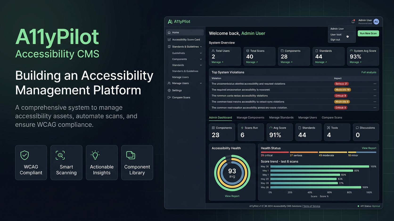
Most teams treat accessibility as a QA step — something you run through a browser extension the night before launch, export a spreadsheet, and call done. The violations pile up faster than they can be fixed, scan results from last month are gone, and no one can answer the simplest question: are we getting better or worse?
A11yPilot is my answer to that problem. It's a full-stack SaaS platform that unifies automated scanning, AI-powered analysis, a 27-component accessible library, WCAG reference docs, and scan history trending — all in one authenticated session, for both developers and designers.
This post walks through every significant design and engineering decision, from the initial persona research to the four hardest technical problems I hit along the way.
💡 What you'll learn
How to design a multi-persona accessibility tool. Why three scan modes belong in one interface. How to debug CSS specificity wars with Flowbite. The right way to position a modal below a sticky header. And why building an a11y tool that fails its own audit is the ultimate irony.
The Problem: A Fragmented Workflow Nobody Talks About
I've worked with enough enterprise SaaS teams to know the pattern. Accessibility starts as good intentions and ends as a spreadsheet nobody reads. The workflow looks like this:
- Run axe DevTools or WAVE
- Export violations to a Google Sheet
- Paste WCAG criterion links into Jira tickets
- Cross-reference component docs in Notion (which is 8 months out of date)
- Re-scan after fixes — with a different tool that gives different results
- Repeat, forever, with no institutional memory
The result: accessibility debt accumulates faster than it can be paid down, and teams have no way to prove they're improving — which matters enormously for healthcare, fintech, and government clients bound by Section 508 or WCAG AA.
Three Personas, One Product
Research with front-end engineers, QA specialists, and designers across SaaS product teams revealed three very different mental models:
- Dev Dani (front-end engineer) — needs to know exactly which component broke and how to fix it. Frustrated by WCAG link dumps with no component guidance.
- QA Quinn (accessibility QA) — owns a 1,200-row audit spreadsheet. Needs to prove the product is getting better over time, not just that it passed today.
- Design Dana (senior UX designer) — wants to build accessible components from scratch, not audit them after handoff. Has no system for accessible design tokens.
All three needed the same underlying data — WCAG criteria, violation details, component guidance — but in completely different formats and at completely different points in the workflow. That's what shaped the product's information architecture.
Information Architecture: 40+ Views Under One Navigation
The IA challenge was real: A11yPilot has over 40 distinct views covering standards reference, scanning, component docs, design tokens, AI tools, and admin. A flat top nav can hold maybe 6 items before it overflows.
The solution: a collapsible sidebar with persistent group state. Power users (QA engineers, a11y leads) navigate between sections constantly — they need persistent, glanceable nav. The sidebar groups remember their open/closed state per session so returning users don't lose their workflow context. A breadcrumb above every page handles orientation in the deep tree.
A11yPilot sidebar (collapsed groups)
├── Dashboard
├── Standards & Guidelines   ▼
│   ├── WCAG 2.1 / 2.2
│   ├── Section 508
│   └── Rules Management     ← import rules from any W3C/508 URL
├── Component Library (27)   ▼
├── Testing & Validation      ▼
│   ├── Accessibility Scanner ← URL / HTML / Screenshot
│   ├── Scan History
│   └── Scan Compare
├── Resources                 ▼
│   └── Design Tokens
└── Admin (admin-only)        ▼
The Scanner: Three Modes, One Interface
The scanner is the daily driver for QA Quinn. Three modes were required, and the UX decision was whether to give them three separate pages or one unified interface.
Three separate pages felt right architecturally but broke the real workflow: a QA session often involves running a URL scan, then pasting a specific component fragment to reproduce a violation. Having to navigate between pages loses context.
One unified interface with a radio/tab selector at the top solves this. The form fields swap based on the selected mode, but the results area stays put. A session feels continuous.
- URL Scan: Puppeteer + headless Chrome renders the target page, injects axe-core, returns the full violation/pass/incomplete tree with node-level HTML snippets
- HTML Paste: jsdom creates an in-memory DOM — instant results with no network request needed. Ideal for testing components before they're deployed
- Screenshot: Google Gemini Vision analyzes the image for contrast problems, missing focus indicators, text-only information, and touch target concerns
Component Library: Closing the Scan-to-Fix Loop
The most impactful product decision was linking scanner violations directly to the component library. When axe-core flags a button-name violation, the violation detail has a link to the Button component page. Two clicks from "what broke" to "how to fix it."
Each of the 27 component pages contains:
- Live preview — interactive, in-browser, not a screenshot
- Variant selector — uses
aria-pressedtoggle buttons, not a dropdown, so it's accessible with Tab + Space - WCAG mapping — exactly which success criteria apply
- Keyboard navigation guide — every key, every state, documented
- Screen reader output — expected announcements for NVDA, JAWS, VoiceOver
- Do / Don't examples — side-by-side correct vs. incorrect implementation

Four Engineering Problems Worth Documenting
1. Tailwind Purging Flowbite's Internal Classes
Flowbite React's Card component uses p-6 internally — but that class never appears in your .tsx files. Tailwind's content scanner uses node_modules/flowbite-react/lib/** as its path, but Flowbite ships its built output in dist/, not lib/. Result: p-6 gets purged in production. Every Card has 0px padding.
Fix: Update the content path to dist/**/*.{js,cjs,mjs} and add an explicit safelist for Flowbite-internal classes. The lesson: when a UI library generates classes internally, those classes are invisible to Tailwind's scanner — always trace the actual build output path.
2. CSS Specificity: .dark a vs text-white
The global dark mode stylesheet had .dark a { color: #60a5fa } — necessary for link legibility. But CTA <Link> components using text-white rendered as blue. Root cause: .dark a has specificity [0,1,1] (class + element). Tailwind utilities have [0,1,0]. Tailwind loses every time.
Fix: Inline style={{ color: '#ffffff' }} on specific CTA Links. Inline styles have specificity [1,0,0] — highest possible without !important.
Accessibility is not a feature. It's a quality dimension. A11yPilot treats it that way — systematically, not as an afterthought.
— Shahriar Alam Shanto
3. Modal Hidden Behind Sticky Header
The scan detail modal used fixed inset-0 with my-8. The sticky header is 60px tall. Net result: the top 28px of the modal — including the URL title and close button — was hidden behind the header. Users couldn't close it without keyboard or scroll.
Fix: Change overlay from fixed inset-0 to fixed inset-x-0 bottom-0 with style={{ top: 'var(--header-height)' }}. The overlay starts exactly at the header's bottom edge. Click-outside-to-dismiss via e.target === e.currentTarget on the overlay.
4. Flowbite Table Injecting bg-white in Dark Mode
Flowbite's <Table> component injects className="bg-white" onto every <TableRow> via its internal theme system. You cannot override it with a className prop — Flowbite's theme always wins. In dark mode: white rows on a dark surface, content invisible.
Fix: Replace Flowbite Table entirely with plain <table>/<tr>/<td> using explicit Tailwind dark variant classes. Zero Flowbite involvement means zero surprise class injection. This is now the project-wide pattern for all data tables.

The power of the web is in its universality. Access by everyone regardless of disability is an essential aspect.
— Tim Berners-Lee, W3C
Accessibility of the Accessibility Tool
There's a particular pressure when your product is an accessibility tool: it must pass its own audit. A11yPilot scans of A11yPilot return 0 critical violations, 0 serious violations.
Measures that made the difference:
- Focus trapping in every modal — focus enters on open, returns to trigger on close
- Skip link on every page —
<a href="#main-content">Skip to main content</a> - No color-only information — impact badges use text labels (Critical, Serious, Moderate, Minor) alongside color
- aria-pressed on variant toggles — not a select dropdown, not a div with a click handler
- prefers-reduced-motion support — sidebar accordion chevron transition respects the media query
- Tested with VoiceOver and NVDA — not just automated scanning
🔬 Meta-accessibility is real accountability
Knowing A11yPilot would scan itself changed how every component was designed. If you wouldn't submit it to your own tool, don't ship it.
Results
- 3URL · HTML · AI
- Scan modes
- 27with live previews
- Components documented
- 97%0 critical/serious
- Own accessibility score
- < 1.2sVite production build
- Cold page load
- ~48KBproduction
- CSS bundle (gzipped)
- 0on own audit
- Critical violations
Five Lessons for Anyone Building Dev Tools
- Build the design system first. The three-layer token system (primitives → semantic → component) paid back every hour invested. Dark mode bugs had one clear fix location: the semantic token layer.
- Distrust UI library internals. Understand how a library generates its output before committing to it. If it injects classes you can't see or override, you'll pay the price in production.
- Account for sticky headers in every overlay.
fixed inset-0is a trap. Always start your modal overlay below the header height, not at the top of the viewport. - Accessibility is design debt, not QA debt. Fixing accessibility after a component is built takes 5–10× longer than encoding the correct pattern from the start.
- Meta-accountability matters. Shipping a tool that fails its own use case destroys credibility instantly. Use your own product in anger before you ship it.
A11yPilot is live at a11y-2.shahriarshanto.online. The full case study with architecture diagrams, competitive analysis, and persona research is on my portfolio.