Hi, I'm Shahriar
Senior UX/UI Designer
UX/UI Designer with 7+ years designing complex, workflow-driven SaaS platforms. I transform operationally complex systems into intuitive, scalable, and accessible user experiences. Specializing in enterprise systems, HCBS platforms, and accessibility (WCAG 2.1 AA).
What I Do
Services
Accessibility & Quality
Description Accessibility & Quality focuses on ensuring digital products are inclusive, usable, and reliable for all users. This service involves evaluating and validating interfaces against accessibility standards, usability best practices, and real-world usage scenarios. The primary objective is to identify barriers, reduce usability risks, and ensure experiences meet both user needs and regulatory or organizational quality expectations. The work emphasizes WCAG alignment, usability validation, and cross-team collaboration—supporting teams in delivering products that are accessible, dependable, and ready for production environments. Key Features Accessibility Reviews & Audits: Conducted structured accessibility evaluations to identify issues related to color contrast, keyboard navigation, semantic structure, and assistive technology compatibility. WCAG Alignment & Compliance Support: Applied WCAG guidelines to assess and guide design and implementation decisions, ensuring interfaces meet accessibility requirements and inclusive design standards. Usability Validation & Testing: Reviewed user flows, interactions, and edge cases to validate usability, reduce friction, and improve task completion across diverse user scenarios. Quality Assurance Collaboration: Worked closely with QA and development teams to track, validate, and resolve accessibility and usability issues during testing and release cycles. Issue Documentation & Guidance: Provided clear documentation, recommendations, and actionable feedback to support efficient fixes and long-term quality improvements. Technologies Used Accessibility Tools: Browser-based accessibility tools, screen readers, and audit checklists. Standards & Guidelines: WCAG, usability heuristics, inclusive design principles. Collaboration: Issue tracking, test reports, and cross-team communication with design, development, and QA teams. Quality Highlights Inclusive & Barrier-Free Experiences: Focused on identifying and reducing accessibility barriers to ensure experiences are usable by people with diverse abilities. Usability-Focused Validation: Ensured interfaces support clear workflows, predictable interactions, and efficient task completion. Production-Ready Quality: Validated accessibility and usability before release, helping teams deliver reliable, compliant, and user-friendly digital products.
UI/UX Design
Description UI/UX Design focuses on creating user-centered digital experiences that are clear, accessible, and effective. This service involves designing intuitive interfaces and thoughtful user journeys that align user needs with product goals. The primary objective is to improve usability, clarity, and interaction quality—ensuring users can complete tasks efficiently and confidently across digital platforms. The work emphasizes structured design thinking, accessibility, and consistency, resulting in experiences that are both visually refined and ready for real-world implementation. Key Features User-Centered Interface Design: Designed clean, intuitive interfaces that prioritize usability, clarity, and ease of navigation, ensuring users can interact with products effortlessly. Information Architecture & User Flows: Structured content, navigation, and workflows to support logical user journeys and reduce cognitive load across complex systems. Wireframing & Prototyping: Created low- and high-fidelity wireframes and interactive prototypes to explore concepts, validate flows, and refine interactions before development. Accessibility-Focused Design: Applied accessibility principles such as contrast, readable typography, keyboard-friendly layouts, and inclusive interaction patterns aligned with WCAG guidelines. Design System Alignment: Ensured visual consistency through reusable components, spacing systems, and UI patterns that scale across products and teams. Technologies Used Design Tools: Figma for wireframing, prototyping, and high-fidelity UI design. Design Systems: Component libraries, style guides, and visual standards for scalable design. Collaboration: Design documentation, developer handoff, and iterative feedback workflows. Design Highlights Visual Clarity & Hierarchy: Focused on layout, spacing, typography, and hierarchy to guide user attention and improve comprehension. Usability-Driven Design Decisions: Ensured interfaces are easy to understand and use, with clear labels, predictable interactions, and consistent patterns. Responsive & Adaptive Design: Designed interfaces that adapt seamlessly across screen sizes and devices, providing a consistent experience on desktop, tablet, and mobile.
Web Development
Description Web Development focuses on building reliable, accessible, and high-quality web experiences that translate design intent into functional, production-ready interfaces. This service involves developing responsive and scalable web applications with a strong emphasis on usability, accessibility, and performance. The primary goal is to ensure that users can interact with digital products smoothly while maintaining long-term maintainability for development teams. The work combines frontend engineering best practices with UX principles, ensuring that interfaces are not only technically sound but also intuitive, inclusive, and consistent across platforms. Key Features UX-Driven Frontend Development: Developed web interfaces with usability and accessibility in mind, ensuring layouts, interactions, and components support real user workflows. Responsive & Adaptive Layouts: Implemented responsive designs that adapt seamlessly across devices and screen sizes, delivering a consistent experience on desktop, tablet, and mobile. Accessible Web Interfaces: Built interfaces aligned with WCAG guidelines, including semantic HTML, keyboard navigation, readable typography, and proper contrast. Component-Based Architecture: Developed reusable and maintainable UI components to support scalability, consistency, and efficient collaboration across teams. Performance & Reliability: Optimized loading behavior, interactions, and frontend performance to ensure fast, dependable user experiences in production environments. Technologies Used Front-End: HTML, CSS, JavaScript, modern frontend frameworks and component-based architectures. UI Integration: Design systems, reusable components, and consistent styling patterns. Collaboration: Developer handoff, code reviews, and iterative refinement with design and QA teams. Development Highlights Clean & Maintainable Code: Focused on structured, readable, and reusable code that supports long-term maintenance and scalability. Usability-Focused Implementation: Ensured interactions behave predictably, with clear feedback, consistent patterns, and user-friendly behaviors. Cross-Browser & Device Support: Validated functionality across browsers and devices to deliver reliable experiences for diverse user contexts.
Content Creation
Description Content Creation focuses on producing clear, structured, and user-centered content that supports usability and comprehension across digital products. This service involves crafting interface text, instructional content, and supporting documentation that aligns with user needs, product goals, and accessibility standards. The primary objective is to improve clarity, reduce cognitive load, and help users complete tasks efficiently. The work emphasizes consistency, plain language, and context-aware content, ensuring that written elements integrate seamlessly into interfaces and contribute to a coherent user experience. Key Features User-Focused Content Strategy: Created content that prioritizes user understanding, task completion, and clarity, ensuring information is easy to scan and comprehend. UX Writing & Microcopy: Developed concise, purposeful interface text—including labels, instructions, error messages, and helper content—to guide users effectively through workflows. Structured Information Design: Organized content using clear hierarchy, logical grouping, and consistent terminology to support navigation and reduce confusion. Accessibility-Conscious Writing: Applied plain language principles and accessibility considerations to ensure content is readable, inclusive, and supportive of assistive technologies. Cross-Team Content Alignment: Collaborated with designers, developers, and stakeholders to ensure content aligns with interface design and product behavior. Technologies Used Content Tools: Figma, documentation tools, collaborative writing platforms. Design Integration: Content embedded within design systems, components, and UI patterns. Collaboration: Iterative reviews, content documentation, and handoff with product and development teams. Content Highlights Clarity & Readability: Focused on clear wording, consistent terminology, and concise phrasing to improve comprehension. Contextual & Purposeful Messaging: Ensured content appears at the right moment, guiding users without overwhelming them. Consistency Across Interfaces: Maintained a unified tone and language style across products, pages, and user touchpoints.
Graphic Design
Description This service focuses on graphic design for digital products and platforms, delivering clear, consistent, and purpose-driven visual assets. The work emphasizes usability, accessibility, and visual hierarchy—ensuring designs support user understanding, product goals, and brand consistency across interfaces and communication materials. The primary goal is to create visuals that enhance user experience, integrate seamlessly into digital systems, and remain effective in real production environments. Key Features Purpose-Driven Visual Design: Designed graphics that prioritize clarity, hierarchy, and communication—supporting usability rather than decorative aesthetics. UI & Product Graphics: Created icons, illustrations, UI assets, and supporting visuals that integrate seamlessly within digital interfaces and workflows. Brand-Aligned Design: Ensured consistency in typography, color, spacing, and layout based on established brand guidelines or evolving design systems. Accessibility-Aware Visuals: Applied accessibility principles such as color contrast, readable typography, and clear visual structure to support inclusive experiences. Scalable Asset Creation: Delivered reusable and well-organized design assets that support long-term maintenance and cross-team collaboration. Technologies Used Design Tools: Figma, Adobe Illustrator, Adobe Photoshop Design Systems: Component libraries, style guides, visual tokens Collaboration: Developer handoff, design documentation, iterative feedback workflows Design Highlights Visual Clarity & Hierarchy: Focused on layout, spacing, and structure to guide users’ attention and improve comprehension. Consistency Across Platforms: Maintained a cohesive visual language across product interfaces, marketing assets, and internal documentation. Accessibility-Conscious Design: Designed with contrast, readability, and usability in mind to align with WCAG principles and inclusive design standard
Selected Work
Featured Projects

Portexa — Multi-Tenant Portfolio SaaS
A freemium SaaS platform where professionals build a portfolio, manage a structured CV, choose templates, and publish their work from one dashboard.

DocAppt — Doctor Appointment & Telehealth Platform
A modern healthcare appointment platform for discovering doctors, booking visits, and managing role-based patient, doctor, and admin workflows.

CryptoVault Shield
A zero-knowledge password manager with a security dashboard, encrypted vault concept, password generator, phishing scanner, accessibility-focused UI, and production deployment.
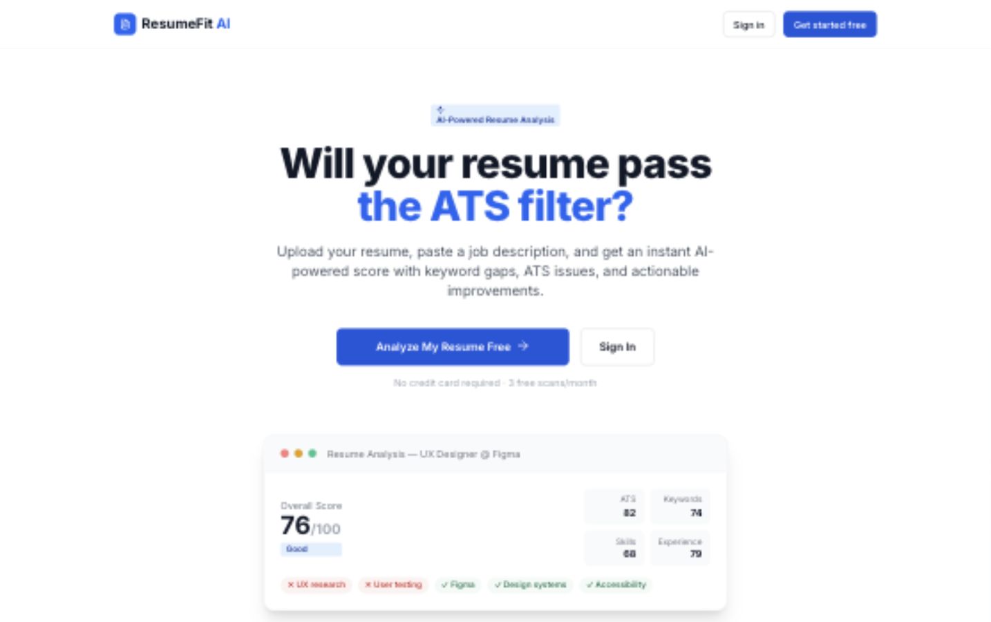
ResumeFit AI
An AI-assisted resume analysis platform that compares a resume against a target job description and returns ATS guidance, score breakdowns, keyword gaps, and actionable rewrite suggestions.

GhoreKaj — Domestic Service Marketplace
End-to-end product design and engineering of a domestic worker hiring platform for Bangladesh, with multi-role portals, verification, bidding, OTP job confirmation, and cash-first payment workflows.
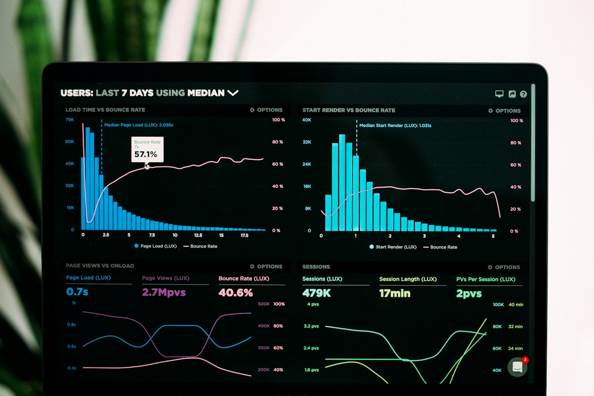
A11yPilot — Accessibility Management Platform
A full-stack SaaS accessibility management platform combining automated scanning (axe-core + Puppeteer), AI-powered analysis (Gemini Vision), a 27-component library with live previews, WCAG reference docs, design token management, and team collaboration — all in one product.
Writing
Latest Posts
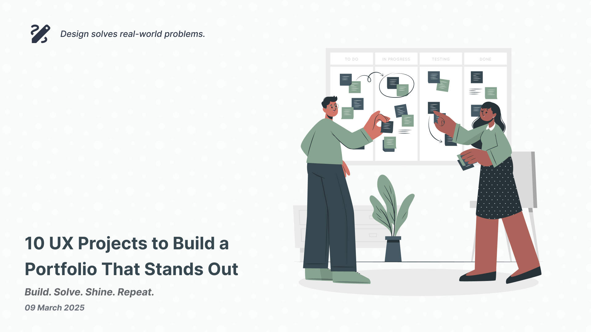
10 UX Project Ideas for Designers in Bangladesh
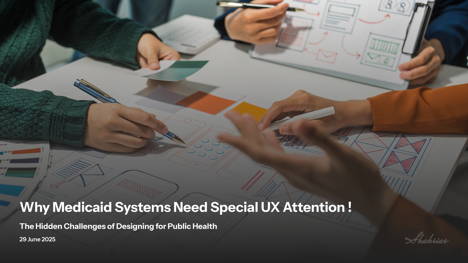
Why Medicaid Systems Need Special UX Attention | The Hidden Challenges of Designing for Public Health

Can Working in the IDDs Sector Elevate Your UX Design Expertise?
Let's build something great together
Available for projects, audits, and full-time opportunities.